Jaspersoft is part of a community of millions of people spread out across many cities and many countries. It occurred to me that looking at our own community and applying our own software to visualize that data could be an interesting way to illustrate just how easy, useful and compelling great BI software can be.
I invite you to send me screenshots of your own community (or other geographically-relevant data) after you try some of the things I describe below.
To “see” our Jaspersoft community, we first began looking at Google Earth to help us visualize the dispersed information we had. Our curiosity and technical development with JasperReports helped spawn the free Google Earth Visualization Project, which in itself is a compelling example of how to leverage the flexibility of an open source tool such as JasperReports to visualize data in new ways. My thanks go out to Lucian Chirita of Jaspersoft Romania who initiated this project. I encourage those who want to explore and contribute to join.
With the Google Earth Visualization package and JasperReports, people can read in address data from Excel spreadsheets or a database and export Google Earth data files in KML or KMZ format, similar to how JasperReports can export PDF, XML, HTML or XLS. JasperReports works with almost any data source, including JDBC-wrapped data for relational databases, JavaBeans (EJB, Hibernate), plain old Java objects (POJO), and XML.
The data can either be processed as a batch data job with a popular and free tool such as batchgeocode or processed as an automated web services job that outputs the KMZ file. Even if you are not a developer, both methods are fun to play around with. However, the web services method is the more compelling and interesting way to go for the more technically savvy.
The Jaspersoft Google Earth Visualization package comes with examples and some sample data. Download it and give it a try! Click here for more information on how to download the source code and example for the package.
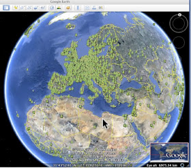
Here’s a quick example of the locations of where our JasperServer customer community in Europe are based:

Jaspersoft isn’t alone in offering cool new tools to democratize the ability for all of us to visualize the data in our lives. Google recently announced an interesting lab project called Google Public Data Explorer. This is a quick and simple way to apply some of their SaaS tools on publicly-available data Google stores on its cloud. The resulting output can be line charts, bar charts, maps or bubble charts. The downside is that you can only use the data Google has and you don’t have the flexibility and power of Jaspersoft’s tools. Still, it’s another start in the right direction.
The visualization of Jaspersoft’s global community showcases just one example of the flexibility of open source to input and output data in a wide range of formats. Our goal is to enable people to visualize data in new ways and bring new meaning or insight to everyday information.
Visualizing data also helps us all better understand community. Here, community can be used as a metaphor for any business environment, marketplace or passion. In Jaspersoft’s case, our community is the global population of developers and customers using our software. Visualizing our community data helps us focus resources where developers in a specific geographies might be doing particularly inventive things that we want to sponsor or encourage. Commercially, it helps us focus more sales attention in specific countries or regions showing the most promise.
You get the idea.
I invite you to send in your own examples of data you’ve visualized. I’ll share cool screenshots with everyone in a later posting. I’ll also call for screen shot submissions on our JasperReports forum. Then maybe we can run a contest allowing you, the community, to vote on your choice of the best “Visualizing Your World” screen shot examples.
Brian Gentile
Chief Executive Officer
Jaspersoft
I read this article. I think You put a great deal of exertion to make this article. I like your work. bookkeeper data entry
ReplyDeleteThank you for taking the time to publish this information very useful! fashiondio
ReplyDelete